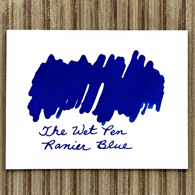
Have you ever been scrolling through Instagram and come across an amazing looking ink swatch? So good in fact that you go a buy a bottle immediately? I have, but I’m a sucker for a good ink swatch. My ink collection certainly proves it. Six years ago, that collection consisted mostly of Lamy blue cartridges, and at the time, that was all I needed. Simpler times. Back then, fountain pen inks were fairly straightforward—mostly blue, black, brown, and red. You picked a color, filled a pen, and went on with your life like a normal person.
Oh, how things have changed, and ink swatching has been a huge driving force behind it.
The first ink that truly made me stop and stare was Organic Studios Nitrogen. I don’t remember exactly when it happened, but it definitely left an impression. Early in my fountain pen journey, blue inks were my go-to choice. They felt more vibrant than black or brown, and there was already a wide range of shades to explore. But Nitrogen was something different. The intense red sheen was unlike anything I had seen before. I quickly fell in love with the way it shimmered across the page. I filled page after page with it, and for a day or two, it looked absolutely incredible.
Then I started noticing the smearing.
Wherever my thumb brushed the page or I flipped through my notebook, the sheen would smear across the paper. My journal entries slowly began to look less like thoughtful reflections and more like I had been fingerprinted at a crime scene. A quick search on Reddit confirmed what I suspected: this ink was notorious for it.
So the hunt for a replacement began.
Around that time, Vinta inks were just becoming widely available, and their swatches were stunning. Kosmos 1955, Dugong Bughaw 1521, and Maharlika 7107 all looked promising. Then there were the Van Dieman’s ink swatches—Shooting Star, Azure Kingfisher, Blue Ringed Octopus, just to name a few. Suddenly there were countless blue inks with red sheen, and before long, I had basically bought them all. Apparently my replacement strategy was less “careful research” and more “catch ’em all.”
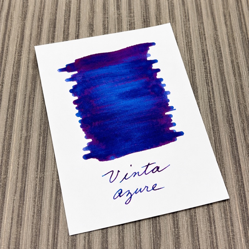
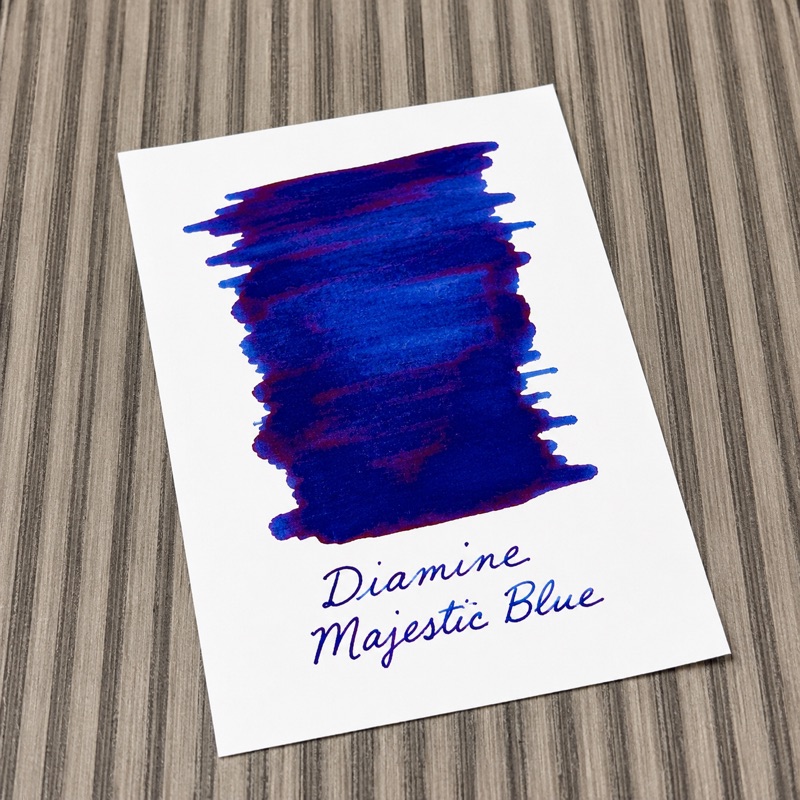
Back then, I didn’t really understand the chemistry behind fountain pen inks or how sheen actually worked. Now I know that sheen comes from excess dye sitting on top of the paper rather than absorbing into it. Understanding that has changed the way I think about those early obsessions with sheening inks.
And that brings me to my point: when choosing an ink, I’ve learned to focus less on how it looks in a beautiful swatch and more on how it performs in actual writing. Swatches are little works of art, and I still love looking at them. They showcase an ink’s wildest characteristics and most dramatic properties. But they often do a poor job of showing what the ink will really look like on the page—or how it will behave after days and weeks of actual use. Over time, I’ve moved away from the heavy sheening inks as I’ve learned more about inks and, more importantly, about the way I use them. The swatches are still just as beautiful as ever. I’m just no longer fooled by them.
Comments
Post a Comment